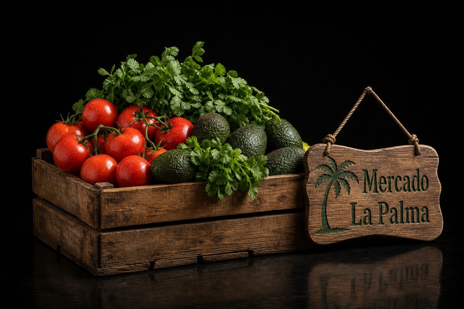
Background
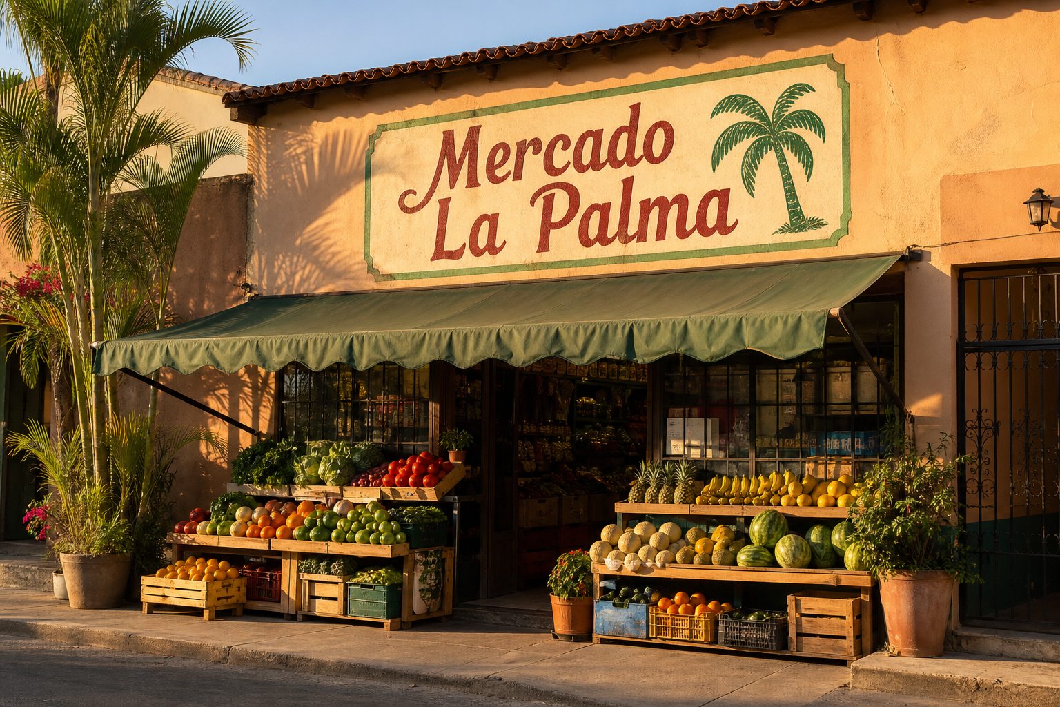
Mercado La Palma has fed its San Antonio neighborhood for three generations — fresh produce, a full carnicería, and recipes handed down across the counter. The store never needed marketing before, but a new generation of shoppers was finding their groceries on their phones first.
Objective
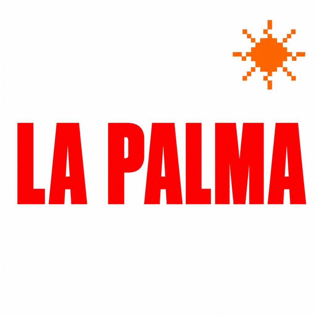
The family wanted growth without losing warmth: a refreshed identity that still felt hand-painted, and a first real website with weekly specials and the menu from their kitchen — something that felt like the store, not a supermarket chain.
Challenges
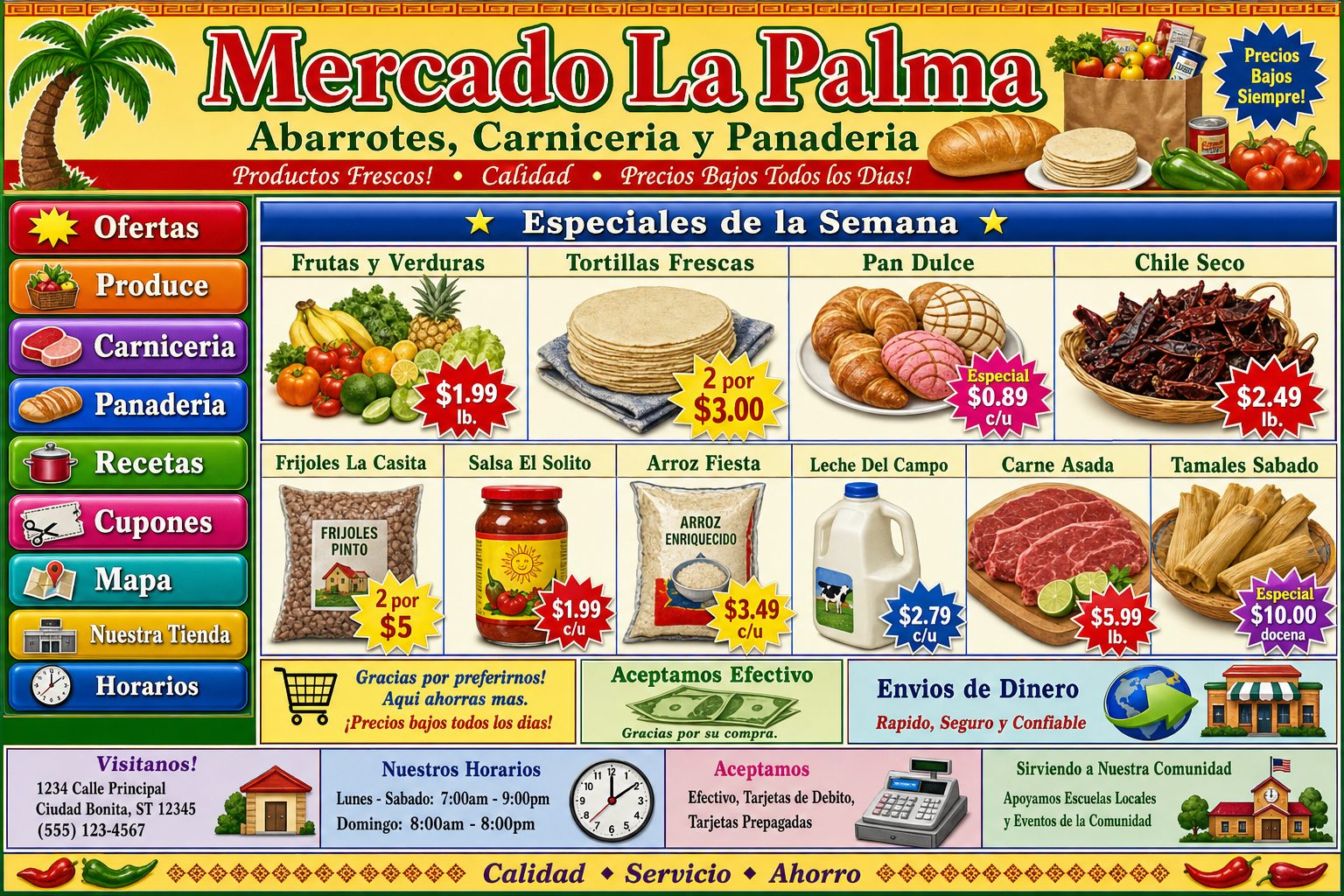
A 2009 One-Pager
A Sign, Not a Brand
Keeping It Familiar
Design Tools Used
Original
Concept Sketches
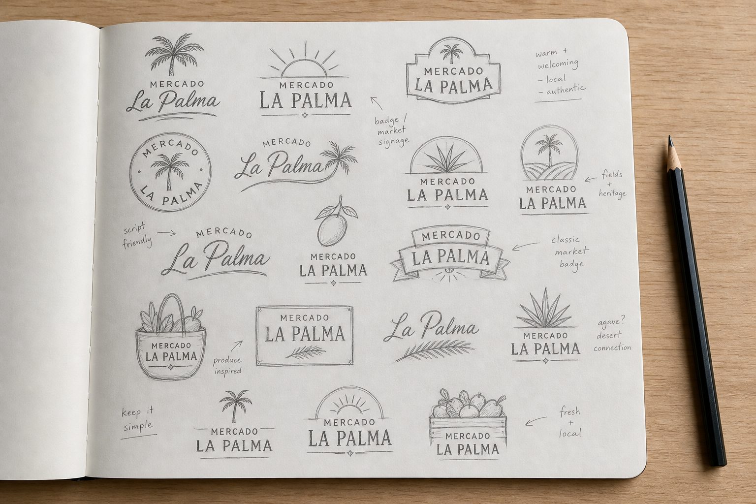
Logo Design: Every sketch started from the storefront's hand-painted heritage — palms, suns, and script lettering — hunting for a mark that felt drawn by hand, not designed by committee.
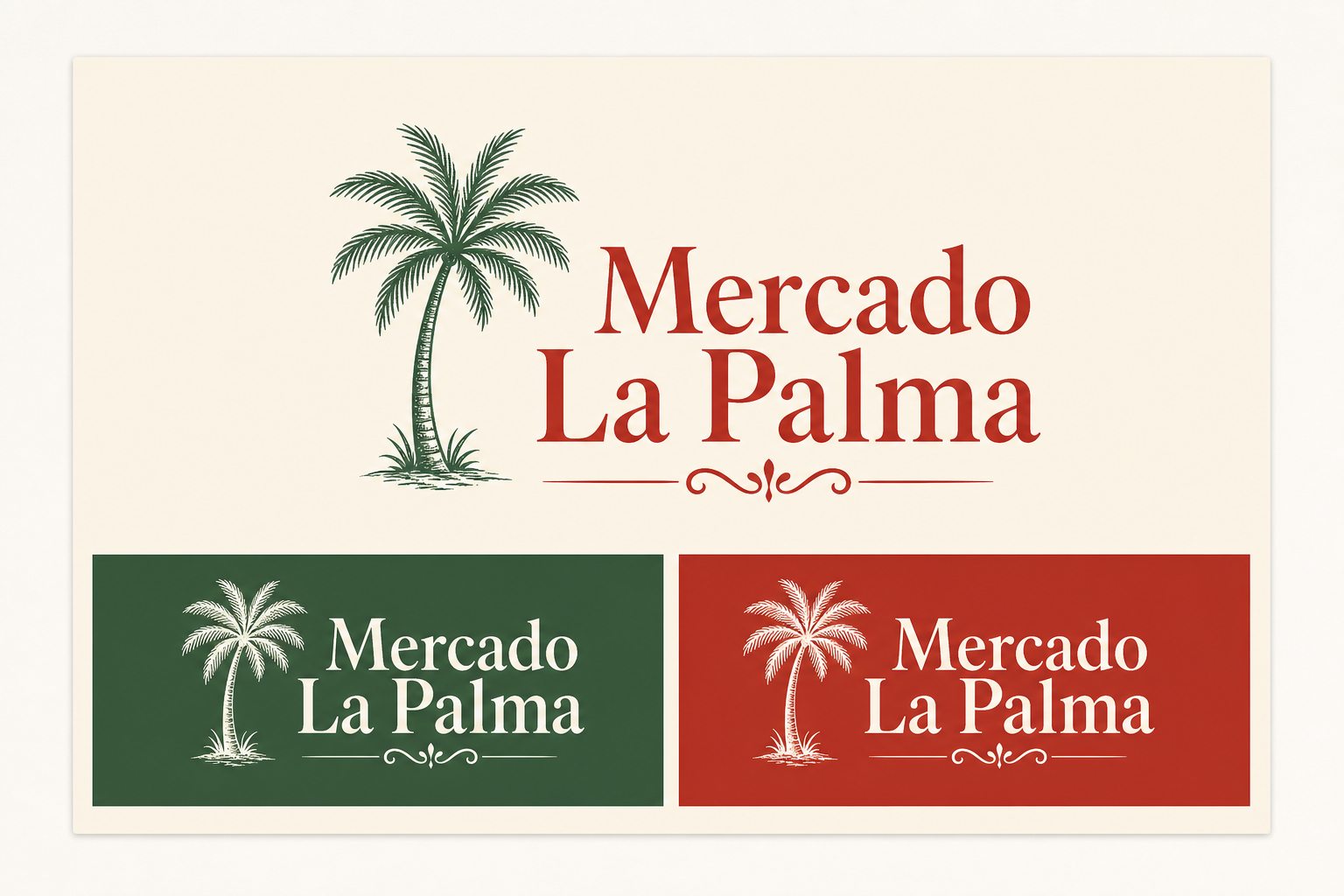
What inspired this decision
A hand-drawn palm and warm serif lettering keep the mercado's painted-sign soul, in a mark that finally works on bags, aprons, and the web.
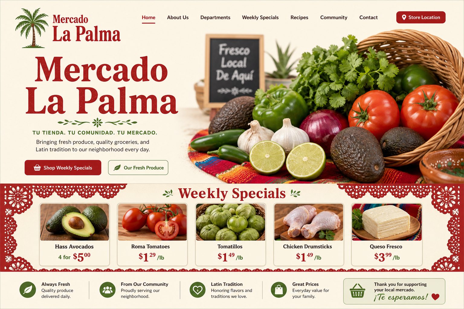
Old vs New Landing Page Design
The 2009 one-pager gave way to a living storefront, with weekly specials and the kitchen menu a tap away.
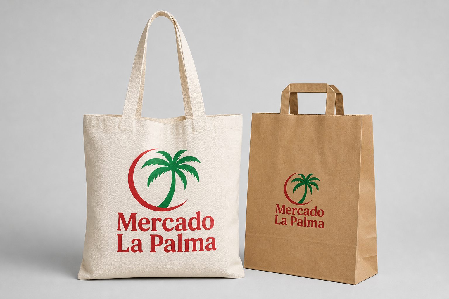
La Palma Totes & Bags
La Palma Storefront
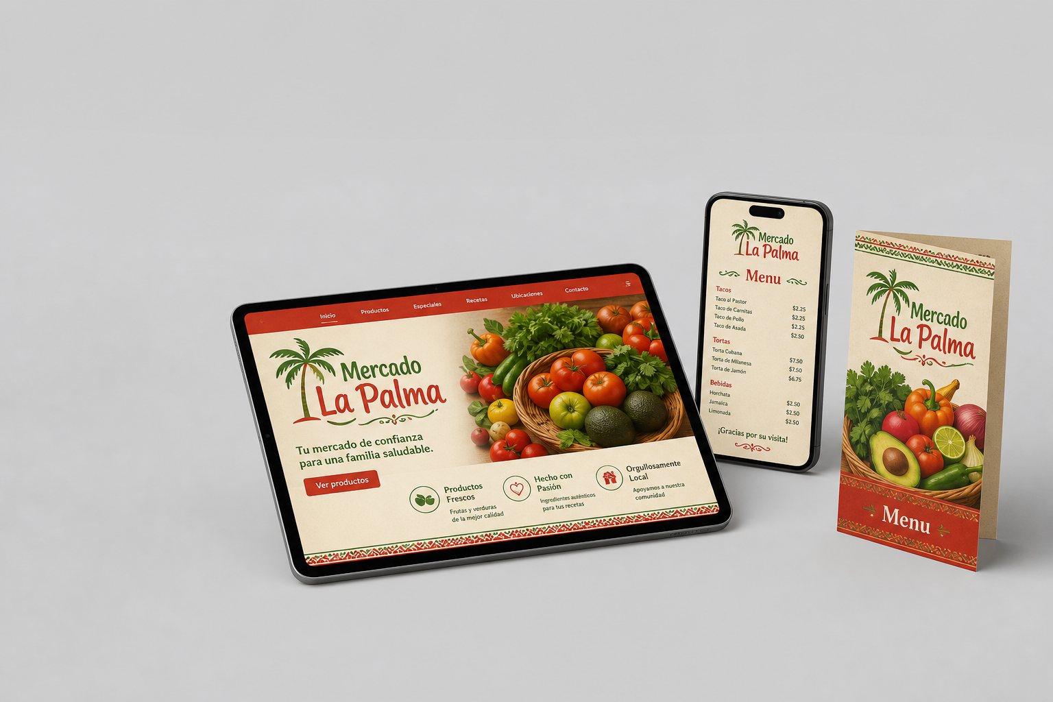
La Palma Brand Suite
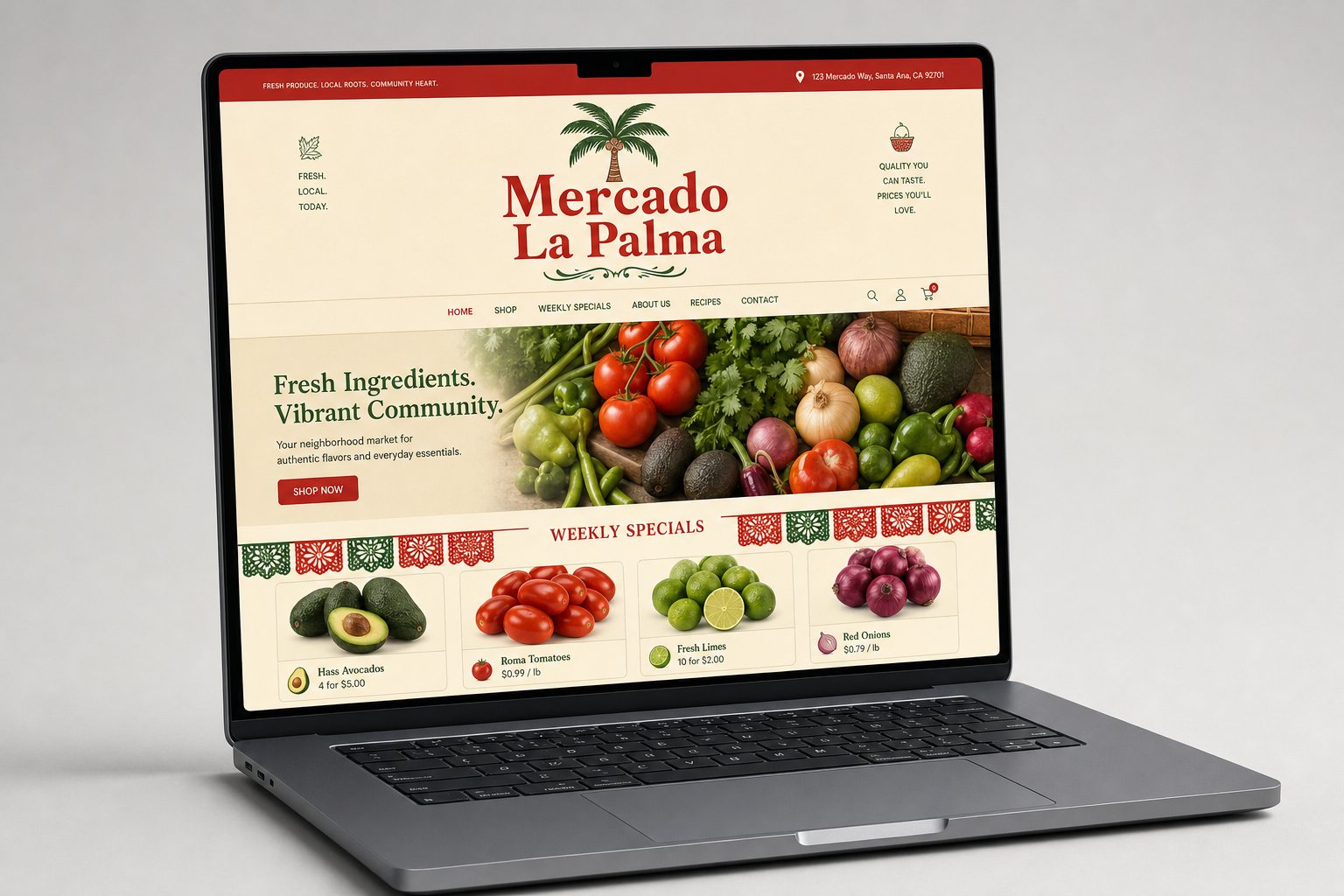
La Palma Website