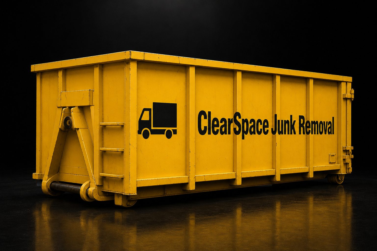
Background
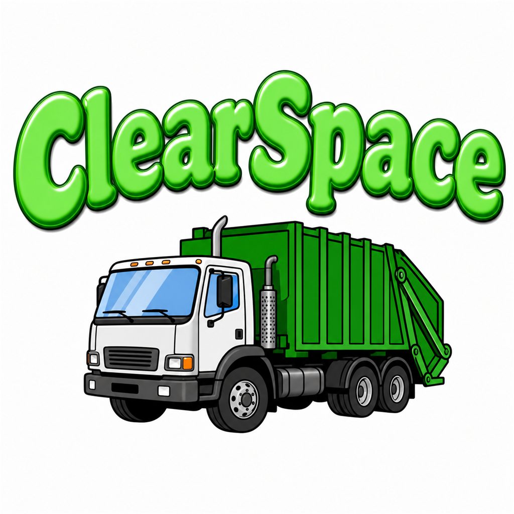
ClearSpace Junk Removal hauls everything from garage clutter to full construction cleanouts across Fort Worth. Business was steady, but the brand looked like a clip-art flyer — and their quote process meant waiting a day for a callback.
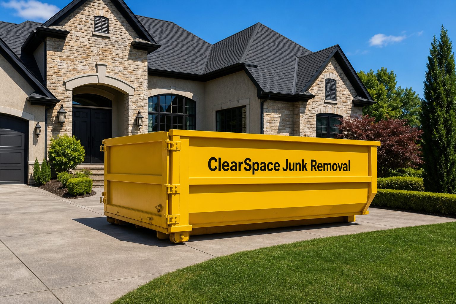
Objective
ClearSpace needed to look like the biggest truck on the block: bold, friendly, and impossible to miss. The goal was a high-visibility identity that works on a 40-yard dumpster as well as a business card, and a site that turns visits into booked pickups in one sitting.
Challenges
Slow Quotes
Clip-Art Identity
Crowded Market
Design Tools Used
Original
Concept Sketches
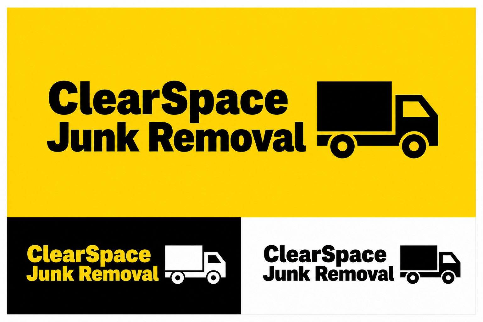
Logo Design: The sketch rounds chased one idea: a mark you could read off the side of a moving truck. Boxes, arrows, and truck silhouettes filled the pages until the boxy truck icon stuck.
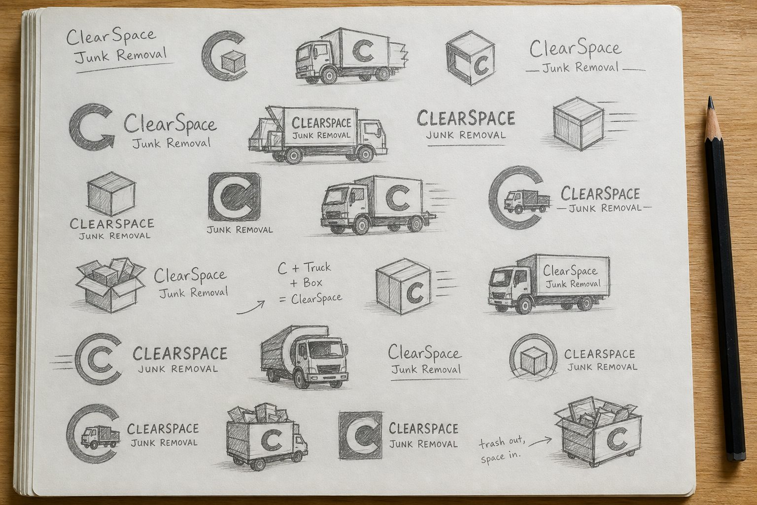
What inspired this decision
High-contrast yellow and black, a heavyweight wordmark, and a truck icon that doubles as an app tile — built to be read at 40 miles an hour.
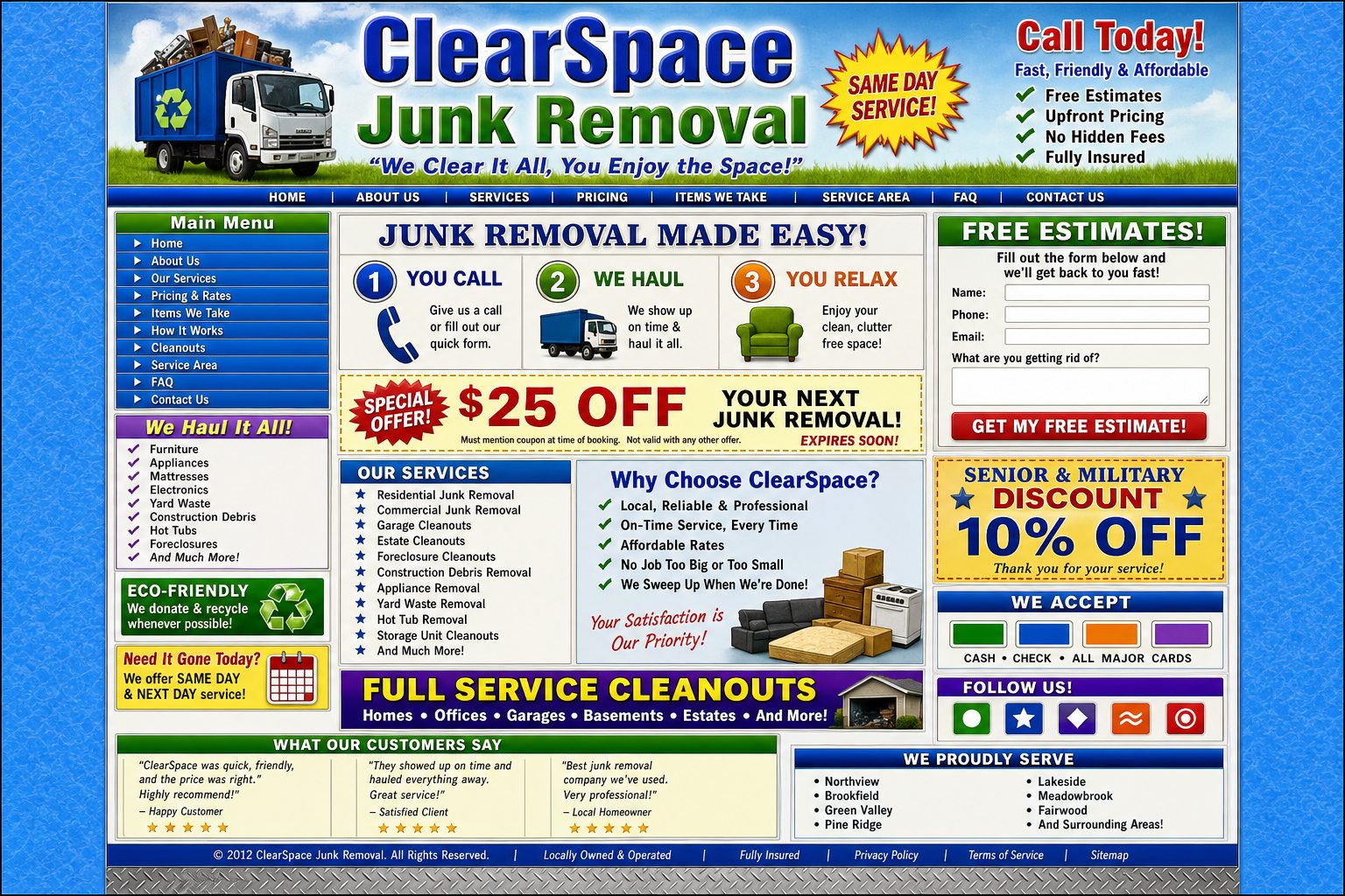
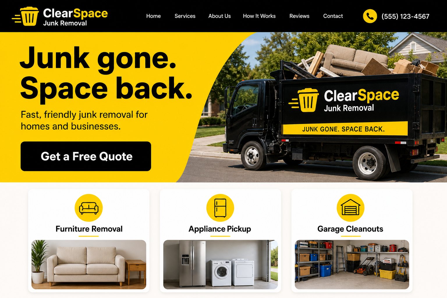
Old vs New Landing Page Design
The old site hid pricing behind a contact form. The new one quotes the job up front.
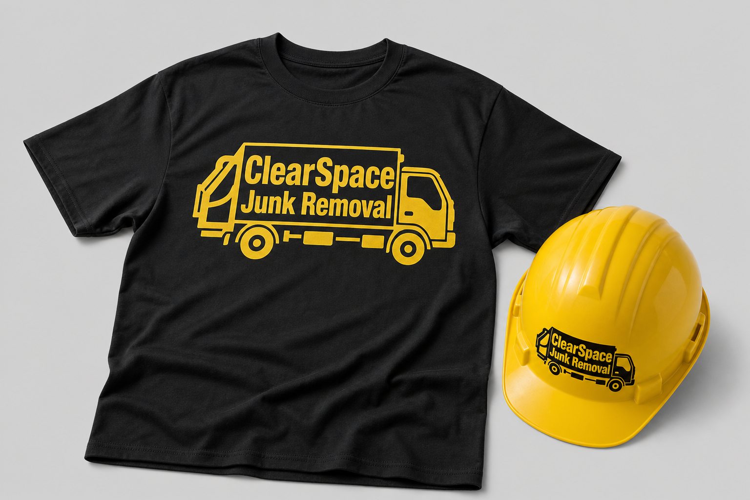
ClearSpace Crew Gear
ClearSpace On the Job
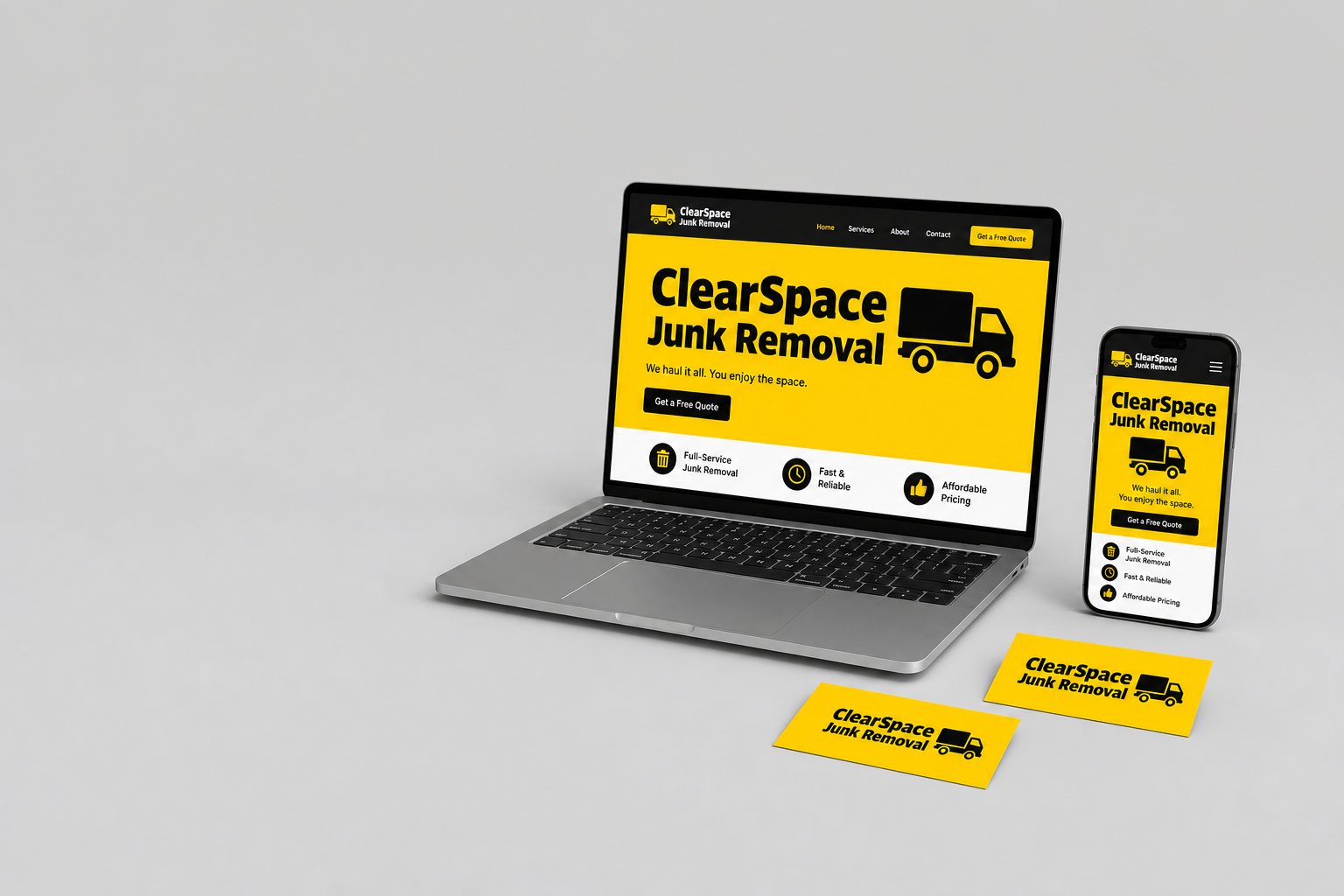
ClearSpace Brand Suite
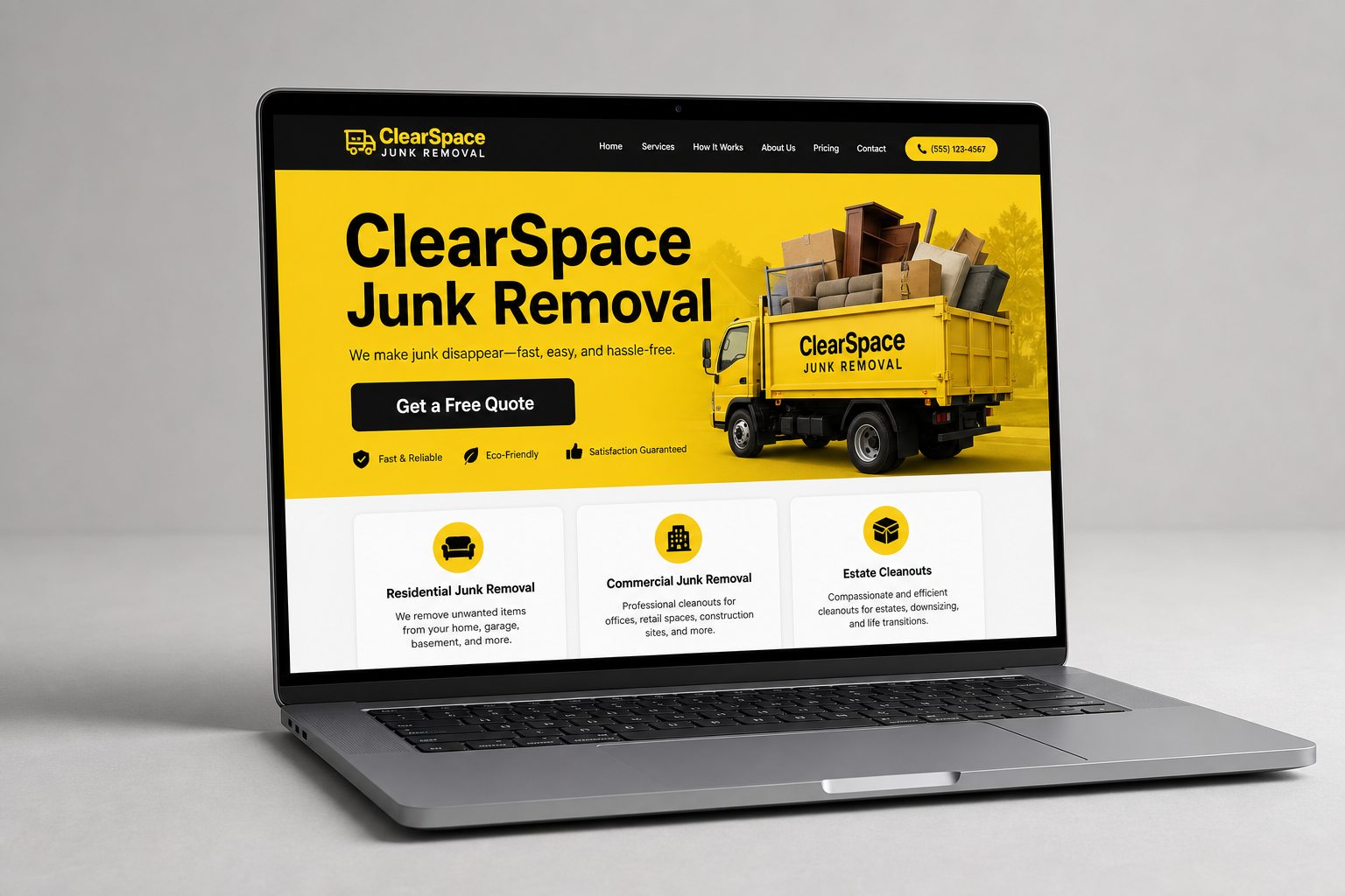
ClearSpace Website